
Calcpad does not provide options to add titles, axis labels and legends to function plots like in Excel. However, you can decorate your plots with these attributes by your own, by using a little Html.
Bellow, you can find a sample code that you can use as a boilerplate. Since chart colors are predefined, they will be the same for all your future plots:
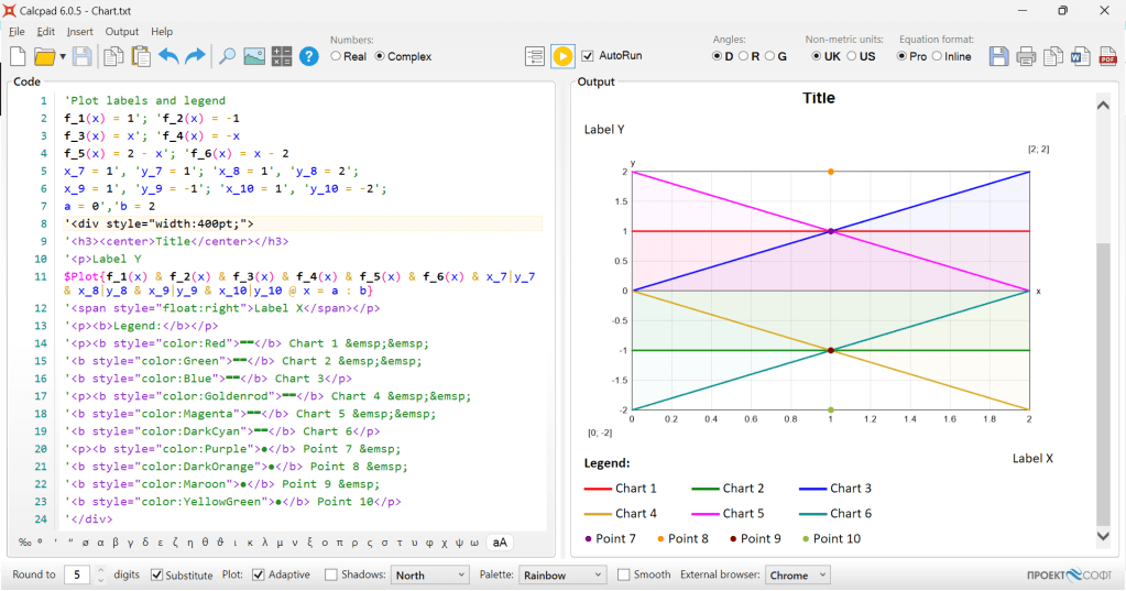
'<div style="width:400pt;">
'<h3><center>Title</center></h3>
'Label Y
$Plot{f_1(x) & f_2(x) & f_3(x) & f_4(x) & f_5(x) & f_6(x) & x_7|y_7 & x_8|y_8 & x_9|y_9 & x_10|y_10 @ x = a : b}
'<p style="float:right">Label X</p>
'<p><b>Legend:</b></p>
'<p><b style="color:Red">▬▬</b> Chart 1   
'<b style="color:Green">▬▬</b> Chart 2   
'<b style="color:Blue">▬▬</b> Chart 3</p>
'<p><b style="color:Goldenrod">▬▬</b> Chart 4   
'<b style="color:Magenta">▬▬</b> Chart 5   
'<b style="color:DarkCyan">▬▬</b> Chart 6</p>
'<p><b style="color:Purple">●</b> Point 7  
'<b style="color:DarkOrange">●</b> Point 8  
'<b style="color:Maroon">●</b> Point 9  
'<b style="color:YellowGreen">●</b> Point 10</p>
'</div>
And here is how it looks inside Calcpad:
If you have less charts, you can delete the extra lines. Also, there is an option for points, if both x and y are fixed. If you have any questions, please do not hesitate to ask them right away.

Hi,
I have two list A and B and I want to plot the graph between this two list using plot function, the two list are not directly related so difficult to make a function between them.
Thank you for the suggestion
LikeLike
Hi!
You should use interpolation functions to map list A to list B. Check this example on GitHub:
https://github.com/Proektsoftbg/Calcpad/blob/main/Examples/Demos/Interpolation.cpd
There you have heights Z above ground and corresponding wind load factors k_z.
It interpolates k_z for Z and plots the graph of k_z(Z).
LikeLike